Flashboard
A dashboard concept for the 2022 floods in Pakistan, designed to show impact and help direct aid without overwhelming the people using it.
- Role
- Self-initiated, solo
- Year
- 2022
- Status
- Concept, not built or tested
The need
In 2022, Pakistan was hit by devastating flash floods during the monsoon. They took lives, destroyed infrastructure and livestock, disrupted the economy, and brought waterborne diseases, psychosocial harm and mass migration.
After the floods, people needed clear information on who was affected, what the impact was, and how to get aid to them. International organisations and individuals wanted to help.
Sorting the information
Researching the cause, effects, prevention and aid for flash flooding turned up a bundle of metrics. With limited time and space, each metric needed a priority and a category, to save people from information overload. I grouped them into cause, effect, prevention and aid.
- 1Because of the urgency, the effects of the flood became the focus, along with how to get aid to the people affected.
- 2A lot of information was saved for cause and prevention, for a second phase. Winter gave a window of three months to prepare for it.
Deciding what comes first
After sorting the list, the goal became clearer. Phase one focuses on effects and aid. Cause and prevention move to a second phase.
Who it’s for
Government officials, NGOs, relief and aid workers, and people looking to help. Their needs set the priority of each metric.
Wireframes
After wireframing, I realised there was a lot of information for someone to sort through. I set each metric’s priority by its weight and urgency, and kept the design clean and minimal, so the landing page stays free of clutter and the relevant data is there.
- 1A navigation bar leads to the other pages: relief and aid, news and updates, the gallery, and resources on flooding.
- 2Carbon is shown because it’s the number one cause of climate change and snow melt.
- 3Metrics for the different groups of people affected, set by hierarchy.
- 4A clickable map, divided into districts. Metrics for each group are split into loss and rehabilitation.
- 5A Twitter feed from the government’s flood relief account, for live updates.
- 6Donor attribution promotes aid. The highest contribution is shown with the name of the organisation or person, and updates when someone gives more.
Colour only on the map
After refining, I was convinced that only the map should be coloured, as it gives the impact needed.
Revisiting it
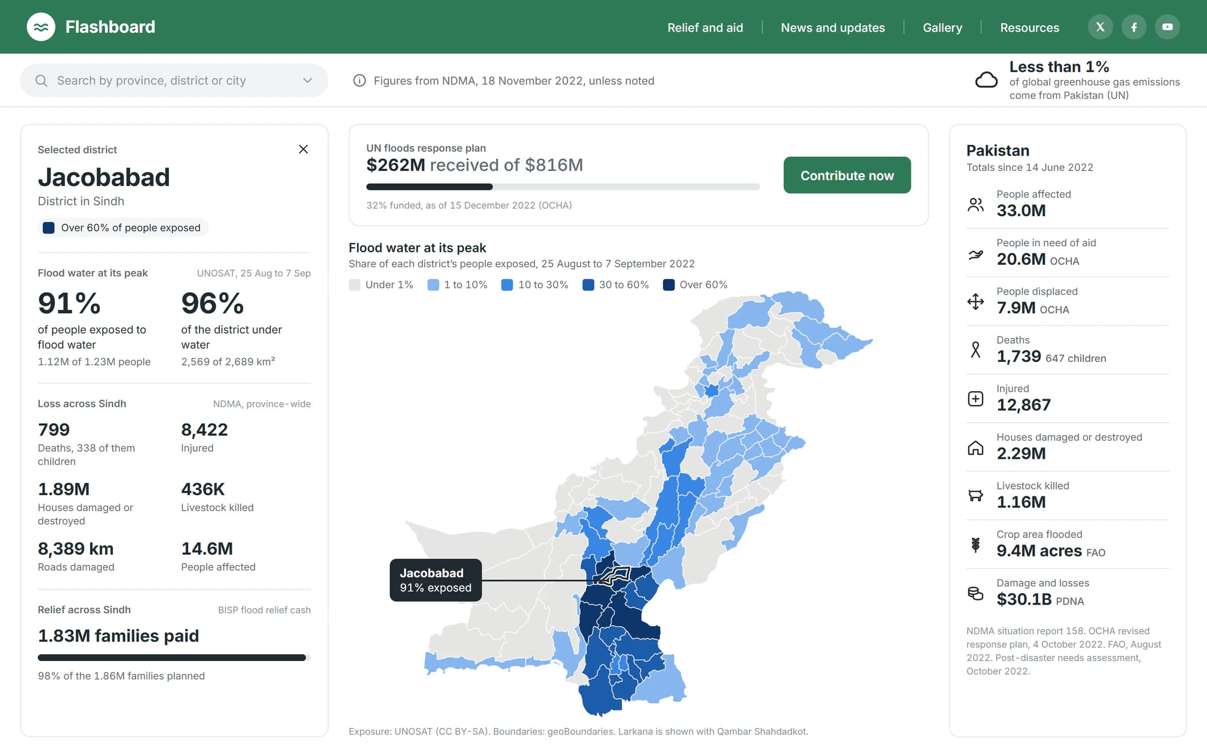
My final screen from 2022 still had placeholder values, and only one district on the map carried colour. In 2026 I rebuilt it with the real figures.
Every figure now comes from a named source: NDMA’s final report on the floods, the UN’s response plan, the post-disaster needs assessment and UNOSAT’s satellite analysis. Every district is shaded by the share of its people exposed to flood water, in one blue from light to dark, which people with colour blindness can read. The first version ran from red to green. The selected district shows its own figures, and says clearly when a figure covers the whole province. Some metrics I planned, like waterborne disease by district, have no consistent public figures, so they’re left out.
- 1Every figure names its source and date, so people can trust what they act on.
- 2Selecting a district on the map shows its figures, split into loss and relief.
- 3Contribute now is there to promote aid and donors’ contributions.
- 4Districts are shaded by the share of their people exposed to flood water, in one blue from light to dark, so colour-blind readers can tell the levels apart.
- 5Only the map is in colour, so the level of impact reads at a glance.
I also added a phone layout, since relief workers are mostly in the field.
What I’d do next
It’s far from complete, but as a concept it works. Next, it needs live data, and testing with the people it’s for. Then phase two: the cause and prevention metrics I set aside. I’d also make a version in Urdu, light enough for weak connections, for people in the affected areas.