Venval
A platform where independent creators of physical products recruit real testers at cost price and get structured, blind feedback before they manufacture.
- Role
- Founder and product designer
- Timeline
- 2025 to present
- Context
- MA Product Design, University for the Creative Arts. Previously named CoastLine.
- Status
- Live build, pre-launch
- Recognition
- Winner, Masters Award for Innovation, Canterbury School of Art, Architecture and Design, 2026
- Tools
- Figma, Next.js, TypeScript, Tailwind, Supabase, AI-assisted development
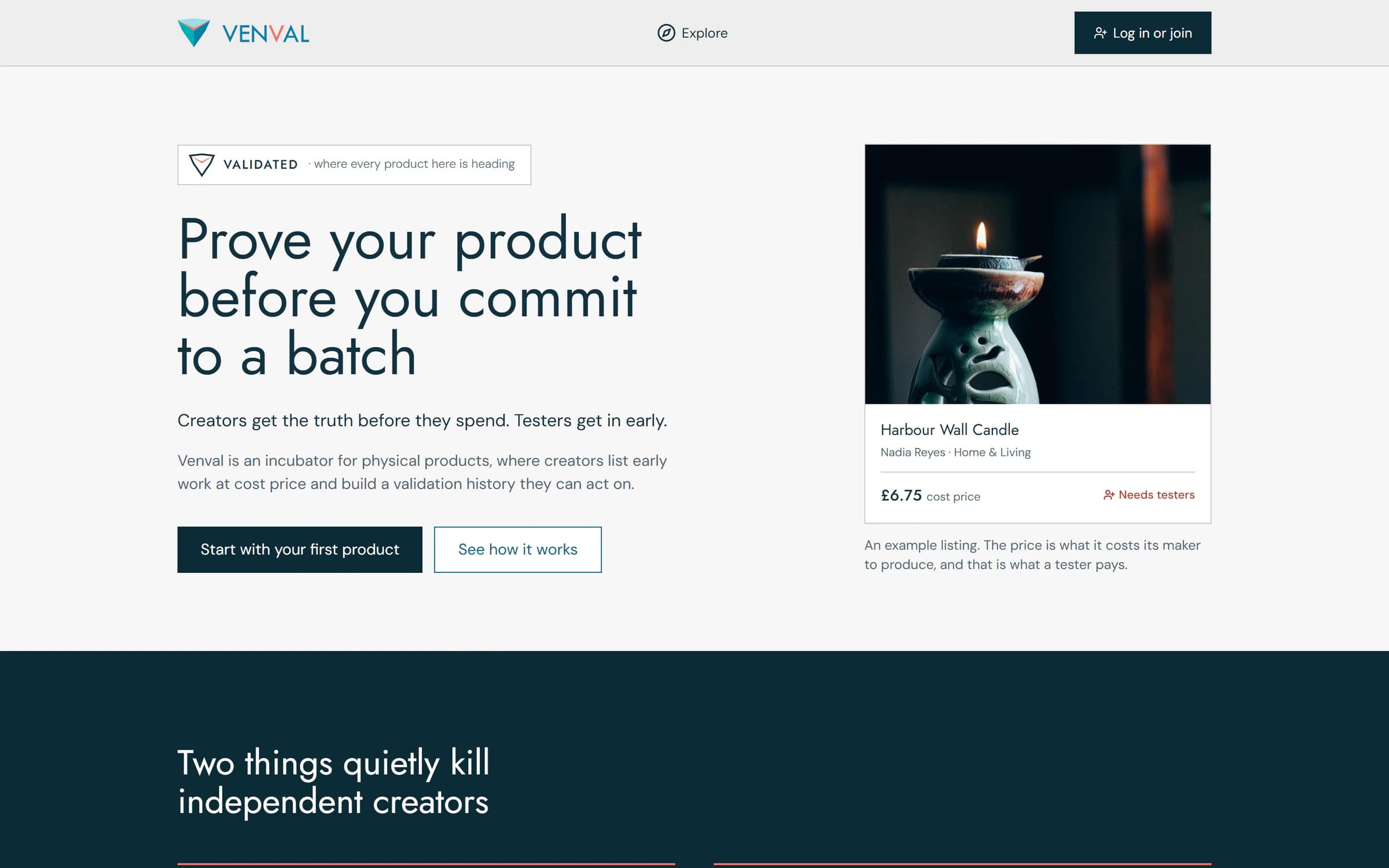
Venval is live at venvalhq.com. You can look around as a creator, tester, supplier or investor at venvalhq.com/demo, with no account.
The problem
Two things quietly kill small creators. The first is dead stock. A creator spends their savings on a production run before anyone has told them the truth about the product. The feedback that would have saved them arrives as boxes that never sell.
The second is proof you can’t trust. Online reviews don’t reflect product quality. They reflect who was given a free unit, or who was loud. So even good feedback can’t be believed, by creators or by buyers.
The project had one goal: give a creator without financial backing an honest answer, before the money is spent.
Research
I started with UK market and competitor research across eight commerce platforms, then four personas and journey mapping. Every platform I studied was built for selling, not validating. Each gives reach, but none gives an early creator structured feedback. Sales become the only signal, and they arrive far too late.
Two findings shaped the product.
The first came from products that failed. Again and again, the decision to build rested on signals that cost nobody anything: likes, page loads, friends saying yes to an idea. Real validation needs a signal that costs the person something. That’s why testers on Venval pay what the product costs to make.
The second came from interviews with independent creators in the UK, found through Instagram and at Canterbury maker markets, with a separate question guide for each of the four roles. One founder had spent three years developing a spirit brand with no way to test it. One line from him changed the structure of the product: “Buyers want the story, not the recipe.” So people improving a product see the full detail, and people deciding whether to buy see the story alone. He later came back and listed his own drink on the platform.
Feedback that tells you what to fix
Testers score six dimensions blind, instead of writing reviews. Creators see the results as a radar chart and a ranked bar chart, so they know what to fix first rather than getting an average.
The six are packaging, material quality, functionality, price fairness, convenience and experience. Each gets its own screen, a plain question and a score out of 100.
I ruled out stars early. A star rating is a verdict on the whole thing, and a verdict is the one thing a creator can’t act on. Tell someone their product is 4.2 and they know it’s mildly disappointing, and nothing about what to change. Show them that packaging sits well below the other five and they know what to fix before a production run.
Scoring is blind so nobody copies the crowd. A tester sees no one else’s scores until they’ve submitted their own.
- 1Scores stay hidden until yours is in, so nobody copies the crowd.
- 2One question per screen, so scoring feels like thinking, not form-filling.
- 1The shape, for the overview.
- 2A worst-first list, for “what do I fix first”.
- 3An average with no spread behind it can’t tell reliable mediocrity apart from a room that disagreed.
Testing it with people
I tested the live build with people who had never seen it, in two rounds, and changed the product after each.
The first round
Four in-person sessions with MA students. Everyone started signed out, with no pitch and no help. I logged 21 problems, and three kept coming up. Three of the four couldn’t find how to sign up, because the main button said “Get started” and led to a page titled “Sign in”. None of the four understood what the place was for. They read it as a shop, and two thought “cost price” was the selling price. Three of the four skipped the reading.
The words failed too. The first version, CoastLine, had an ocean vocabulary: testers were Divers, suppliers were Chandlers, points were Tides and an award for useful feedback was a Pearl. Not one participant could work out what any of them meant. The app had already voted. The menu said Diver, but about 96 sentences of everyday copy said tester. So the invented words went, and plain ones replaced them.
I fixed all 21 problems in five focused work sessions.
- 1People didn’t realise they could pick more than one role: the cards looked like an either/or choice. Ticks made multi-choice visible before clicking.
- 2The roles that need approval now say so in words, because one symbol was doing two jobs.
A new name
Then an expert tested it. He ran technical operations at a chocolate factory, and in his words the CoastLine interface made “zero impression”. The mechanics held up. The look didn’t. I could have defended it, but taking that criticism seriously is the decision the project turned on. It started the new name and identity. Five candidate names went through the same four checks: say it aloud and spell it back, the UK trade mark register, Companies House and the domain. Venval was the only one to pass all four.
The second round
A professional UI/UX designer with about ten years’ experience walked through the rebuilt platform. She said the homepage “sets riddles”, and her sharpest catch was about money. A tester could apply, be told what happens next, and only meet the price after committing. The app wasn’t silent about money, which would have been better. It told a story with the money missing.
- 1The creator shows what the product really costs to make, and a tester pays exactly that.
- 2Say the number at the moment of deciding. A story about your money must never skip the part where you pay.
Another participant spent an hour building a real listing on a recorded call. He found that the Validated badge, the point of the whole platform, appeared once on the home page, at the bottom. It now sits above the headline: “where every product here is heading”.
In an unmoderated test, a classmate used it alone on their own phone. Unprompted, they asked for three things: anonymous scoring, so nobody scores a friend kindly; proof of who suppliers are; and only qualified people testing early work. All three already existed. The design matched what people expected before anyone explained it, and that’s the evidence I trust most.
The design system, in code
Building fast had a hidden cost: every button was invented on the spot. When I counted, the app had 61 hand-made primary buttons, 36 outline buttons, 101 hand-made boxes and one shared style. No single button was wrong. The absence of a system was.
I replaced them with five parts, made once and used everywhere: a button, a submit button that shows when it’s busy, a card, form fields, and numbers and badges. Around them sit tokenised colour and type, a contrast checked palette, 44px minimum touch targets and a 375px mobile baseline. A script measured every tap target on every page. 131 were too small before, and none after.
Automated checks weren’t enough on their own. The first pages sat on a blue-tinted paper under blue ink, which weakens colour contrast in a way standard checkers can’t see, because they measure light against dark, not colour against colour. I moved to a grey at exactly the same brightness and re-measured 305 colour pairings. None got worse.
Building it
I built the platform in Next.js, TypeScript, Tailwind and Supabase using AI-assisted development. I owned the architecture decisions and the fixes from three external audit rounds.
Before any ordinary user saw it, I asked three reviewers to be unkind: one on the product, one on the experience, one on security. The security review found that any signed-in person could make themselves an administrator, because people could edit their own row and the row included their rank. I fixed it the same day and checked that nobody had used it. I’d reasoned carefully about who owns a row, and not at all about who owns a column inside it.
Working with an AI agent taught me where it’s weak. It doesn’t get irritated. A person hand-writing 61 near-identical buttons would stop around number six and build a system. An agent won’t, so consolidation has to be asked for. The most useful lines in my brief to it turned out to be prohibitions, like “don’t invent words”.
What’s next
The platform works end to end, but its central transaction hasn’t yet happened between two real strangers. The next step is a first round with 20 testers and 5 creators, recruited partly from a university product design cohort and run partly by hand. The first honest round matters more than the elegance of its plumbing. Payments run in demo mode until then.
I don’t claim market validation yet. That claim gets made when a real round earns it.